Thursday, July 27, 2006
Photoshop
I printed 3 more layouts today - so hopefully I'm all caught up with printing. And I bought Photoshop 6.0 on eBay today, so I guess I made my decision - LOL! Here's what I figured - I sold an embroidery hoop about a month ago for $85, and I've been saving that money for something special. Then I sold some embroidery software last week on eBay, which netted me $329. I also have some other software I'm selling which won't sell for anything close to the first one, but is currently at $39. So I figure if I'm ever going to buy it, now is the time, right?
Wednesday, July 26, 2006
Printing
I realized I hadn't printed any layouts in awhile, so I printed six layouts today! I love the way they look when they're printed. I really need to do a better job of printing them as I do them. Anyway, I think I may be caught up on the ones I want printed now - I'll have to go through all my layouts and see. And next step is to burn them all to a cd to be sure I have backups of everything - I sure don't want to lose anything!!
I'm also considering buying Photoshop. I've been using Photoshop Elements for a long time. I won't pay the full price for it ($649!!!). But I discovered yesterday that I could buy an older version of it on eBay for around $100, then buy an upgrade version for $169. So now I have to decide if it's worth almost $300 by the time I add shipping costs and everything. It has some features I would like, but is it worth the $$$? Still not sure. But since I sold my old embroidery software for a little over $300, I'm considering it. Of course, I did just buy a Wacom tablet, but I would have bought that eventually anyway. LOL!!
I'm also considering buying Photoshop. I've been using Photoshop Elements for a long time. I won't pay the full price for it ($649!!!). But I discovered yesterday that I could buy an older version of it on eBay for around $100, then buy an upgrade version for $169. So now I have to decide if it's worth almost $300 by the time I add shipping costs and everything. It has some features I would like, but is it worth the $$$? Still not sure. But since I sold my old embroidery software for a little over $300, I'm considering it. Of course, I did just buy a Wacom tablet, but I would have bought that eventually anyway. LOL!!
Sunday, July 23, 2006
Fred
Saturday, July 22, 2006
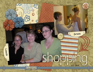
Shopping
Tuesday, July 18, 2006
Daily Life
I finished another set of circle journal pages tonight. I was pretty worried about the theme at first, because it is "your daily routine" and I don't really have a daily routine. At least, not in the sense that a lot of people do. I don't work outside the home, so I don't have a strict time structure. But then I got to thinking that I really do a lot of the same things every day, just not necessarily at the same times each day. So I concentrated more on what I do than on when I do it, and had fun with it. So here you go, here are my pages. I put them together so you can see what they will look like side by side.
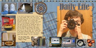
The journaling reads: "I am retired, and because of that, I don't live on a time schedule. But I do a lot of the same things every day. (1) I try to walk two miles most mornings. (2) I eat the same breakfast every day. (3) I usually read a book while I eat my breakfast and lunch. (4) I take good care of my cat, feeding him twice a day and emptying his litter box daily. (5) I am very lucky that my husband cooks dinner, but I do have to clean up after him (pretty small price to pay, I'd say). (6) I spend time on my laptop computer every day. (7) I sew with friends once a week. (8) I eat frozen yogurt most evenings. (9) I'm a chocoholic.
"I'm very happy with my life and I wouldn't change a thing!"
Credits: Inspire Me kit by Lauren Grier
Font: CBX-Watson
MISC: Atomic Cupcake's Pristine Chipboard Effect on Bernard MT Condensed font
And by the way, I took the photo of myself in the mirror, then I flipped it in my software so that you can actually read the name on the camera. This way it looks like someone else is taking a picture of me taking a picture! LOL!! If I hadn't flipped it in my software, the name on the camera would have been in reverse. I was pretty proud of myself for figuring that one out. LOL!!
Sunday, July 16, 2006
Published Layouts
I just found out Friday that I am having 3 of my digital layouts published in a magazine called Ready Set Create! I am SO excited about it!! These are my first published layouts, and I'm getting 3 published at once! I guess it helped that I submitted 12 all at one time. So today I went to all my galleries and substituted "removed for publication" statements for the layouts. This publication doesn't actually require it, but they do prefer it, so I was more than happy to oblige them. I guess I should remove them from here, too. I can upload them again after the magazine is published. The layouts that were accepted are the tribute to my dad, the one of my husband fishing, and the one of our dog.
Tuesday, July 11, 2006
Explore
 I did another layout today. I took this photo of my son and his fiancee, along with several others, in February. I had already scrapped some of the others, but had been wanting to do something with this one. I finally got around to it with Lauren's beautiful kit.
Credits: Carry On Kit by Lauren Grier of Sweet Shoppe Designs, Simply Stitching by Christine Nash, Word Art by Tina Chambers, Date Stamp by Meryl Bartho. Scraplift of this layout by Shari Barnes: http://www.scrapbook-bytes.com/gallery/showphoto.php?photo=54643. Font - Henry Morgan Hand.
Sunday, July 09, 2006
So Cute
I created an unusual layout today. Lauren asked each of us who was willing to do a layout of a donkey for Amanda, another designer at Sweet Shoppe Designs. Now I don't know exactly why she wanted us to do this; I know it was some sort of a joke because I guess Amanda likes donkeys. Another one of the team members had a picture of donkeys that she emailed me, and so I did this layout. I didn't mind doing it; it was actually pretty fun.
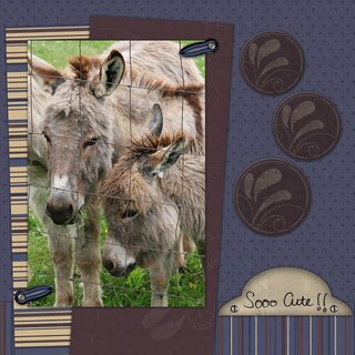
Credits: Carry On kit by Lauren Grier
Tab from Punky Mom kit by Lauren Grier
So Cute doodle from Girl Notes kit by Lauren Grier
Sketch - Layout Blueprint #6 - left page
Photo from Susan Toon

Credits: Carry On kit by Lauren Grier
Tab from Punky Mom kit by Lauren Grier
So Cute doodle from Girl Notes kit by Lauren Grier
Sketch - Layout Blueprint #6 - left page
Photo from Susan Toon
Friday, July 07, 2006
First CT Assignment
 I did my first assignment for my new CT today. It was just a bit of a challenge, since the kit was more girly than I normally use. Luckily it was more girly than Lauren usually designs, so I won't have that challenge again any time soon. But I was able to find appropriate photos, so it worked out great. We gave Jessica a new pillow for Christmas last year and I hadn't scrapped the photos yet. The large photo was pretty good, and the smaller ones weren't that great, so this layout worked for these photos. Lauren liked the layout too, so it's all good.
Credits: Vanessa kit by Lauren Grier, Date Stamp by Meryl Bartho, Sketch by Scrap Maps.
Wednesday, July 05, 2006
Punky Girl
I have exciting news to post today - I got my creative team that I applied for earlier in the week!! And I really am thrilled!!! I just got notified today, which actually was earlier than I expected. In fact, when I saw the email so early, I was afraid it might have been a rejection. But no, it wasn't.
Sunday, July 02, 2006
Creative Team Call
 I applied for a Creative Team today. I don't know whether I'll get it or not, but I'm really hopeful. All I had to do was send an email with a link to my gallery and a brief blurb about why I wanted to be a "Punky Girl." But I was impressed enough by this designer that I decided to buy one of her kits and scrap a page instead, hoping to get noticed. Shameless, I know! But I hope it works. I uploaded the page to a new gallery and emailed her 2 links - that one and my scrapartist one. I've already gotten a reply from her that she got my email and that my layout made her smile. So that's good at least. She won't be making a decision for a week or so.
Journaling reads: "When I saw your Creative Team call in The Sweet Shoppe Designs Forum, I went to Elemental Scraps to look at your kits right away, since I wasn't familiar with your designs, and all I can say is WOW! I was just blown away by several of your kits. I wondered how I was going to show you in an email that I really want to be part of your team? So I decided that I had to do it this way; I had to scrap a page with one of your kits. I hope you like what I've done!"
Credits: Punky Mom kit by Lauren Grier; Paper tear by Stephanie Krush; Font: Cheryl
New Header
I decided I wanted to put my own header on my blog, so that's what I worked on today. I had some terrific help from this blog: http://lindsayteague.blogspot.com/2005/07/how-to-2.html. Thanks Lindsay!! Boy, it wasn't hard for me to create my header, but getting it to show up, that's another story all together. It showed in the preview, but when I'd publish, it wouldn't show up then. Talk about frustration. I think it finally came down to I didn't have a semi colon after the url for the header (but then why did it show up in the preview?). From what I hear, if I was willing to pay for a Typepad blog, it would be a LOT easier to do things like this. I love having a blog, but not quite enough to pay for it (yet). So I'll just have to struggle through for now I guess.
Subscribe to:
Comments (Atom)


